
Before Tableau, I made a lot of dashboards in Excel. It has been quite difficult to free myself from the constraints that Excel (or other standard tools) forced upon me when it came to storytelling with data. Let me explain.
In the past, with other tools, I would envision the outcome first and work backwards. Often I would be specifically asked for a certain type of chart showing certain information; sometimes I would be asked to investigate a problem, but I would still jump to the type of chart(s) I needed first and then go about getting my data into the state needed to put it in those charts.
If I was part of a committee or project it could be even worse - a dozen people drawing a dashboard on a whiteboard before anyone has even collected the data or had any understanding of data, analysis, or dashboard development. Disastrous. This video nails it - how many times have you felt like Anderson? That you're trying to explain that blue is not red.
Today, with Tableau, I go about it differently. I don't start with the assumption that I need a particular chart and I don't assume that I know exactly which variables to consider, but I have some hunches to start with.
It does get more complicated when you're building a dashboard that tells a story and isn't just a bunch of charts crammed together. Here's some basic, simple tips that hopefully will help.
1. Know Thy Audience

Who needs to know the answer to the problem? Just the VP? Or will others need to use what you've built to make or track changes? Don't try to just impress the VP and forget that he/she will be sending this to others if she/he finds it useful. Will it help them?
How will they use what you build? Laptop, mobile, live presentation? How are they used to getting information? If it's been static, printed reports, you will need to start slow and do a lot of handholding.
Keep it simple. Less is more. Is your audience used to dashboards or just seeing one chart?
Are they distrustful of anything other than tables of numbers? Will they want to see all the data? You could set up a dashboard that explains how to extract the data, providing them with basically a pivot table and multitudes of filters. Also, remember to include an "About the Data" dashboard where you provide all the details about the source, extraction, inclusions/exclusions, calculations, and definitions.
2. Know Thy Data

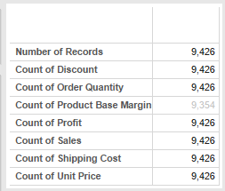
Get in, get dirty with your data. Analyze the hell out of it. Understand the relationships between all your fields. Deal with your nulls - know where they are. Make a frequency table of all your numeric fields. Know what all the categories are in your dimensions. Replicate existing tables to test your results. Test your new calculations - make sure they behave properly when filtered or aggregated.
You need to know and understand your data's history. Where did it come from, what's the work process behind it, who and when is it entered, what does it include, what does it exclude? If you wrote the query that's great (don't forget to document), but if you didn't, you need to know all the details about it.
3. Preguntas
 Start with What and keep asking Why. Exhaust your curiosity. You may not use all of the charts that you create in this exercise, but you will have all the ammunition that you need to put the story together.
Put your questions in the Title of your views (charts and tables), this will help arrange the story when you put the charts on your dashboard. You can clean them up when you are finalizing the dashboard.
Remember your audience - what would be important to them? What questions will each chart illicit from them?

4. Talk, Talk, Talk

4. Talk, Talk, Talk
That's 3 talks.
When building your dashboard, think in 3s. Three charts, 3 filters, 3 sections, 3 colors, 3 fonts, etc. Less is great, but try not to go over 3 unless there is good reason to do so. This is where you begin; until your audience gets accustomed to the style and interactivity, this is the simplest approach. It's a suggestion - not a rule.

Once your audience gets more savvy with this reporting style, you can build more complex dashboards.
Imagine your dashboard is in an elevator with the CEO and it has three sentences to back up it's story. So make sure your charts are related - start high level, then go to detail - or show 3 key measures that impact something.
Simple is hard. Especially when you're in the thick of it. It's much easier to write a run-on sentence than it is to use proper grammar. It's easier to make 75 charts and stick them in a PowerPoint deck than it is to build a smart, clean, interactive dashboard. Remember this: Complexity is often used as an excuse for Obfuscation. Someone else may think that you couldn't get to simplicity and not trust in your results.
5. Shuddup Already

Take some time away from your dashboard. At least overnight. Then when you open it up the next day, try to look at it from a bit of distance.
Look at the chart that grabs your attention first. Is this the chart you want the user to focus on first? Does the next chart relate logically?
Is it screaming at you? Start to take away stuff. Unbold, make white space, calm the whole thing down.
Did it seem like I was screaming at you about simplicity? Sorry about that. I'll shuddup now. Happy vizzing!
